Consulting
Experience
Expertise in Finance, Accounting & IT
AI, Compass and new possibilities for reporting & planning
With the Q3 2026 release, SAP is expanding SAP Analytics Cloud (SAC), particularly in the areas of artificial intelligence, simulation, visualization, and planning. In addition to new AI-powered features, users will gain enhanced capabilities for scenario analysis and dashboards. At the same time, everyday processes are simplified through Stories and Data Actions.
We provide a concise summary of the most important innovations and their practical added value.
With Q3 2026, SAP Analytics Cloud is expanding its native chart library to include Sankey, funnel, and gauge charts. Gauge charts are particularly well-suited for the concise presentation of KPIs against target or threshold values. Funnel charts visualize drop-off and conversion points within multi-stage processes, such as a sales pipeline. Sankey charts depict flows between categories, with the width of the connections visualizing the respective magnitude. This allows, for example, value flows within a profit and loss statement or budget distributions to be clearly represented. Additionally, the new Quick Builder simplifies the selection and configuration of suitable visualizations.
The main advantages of this innovation:
With Q3, SAP is expanding AI support in Stories with two new features. The AI-Assisted Prompt Insights Widget connects a pre-configured prompt with the context of a table or chart and generates a short, data-driven analysis. This allows, for example, deviations, risks, or unusual trends to be categorized directly within a dashboard. Additionally, AI-Assisted Story Code Generation supports Story Designers with scripting. Users describe the desired logic in natural language and receive a suitable script suggestion, which can be reviewed and adopted in the Script Editor. This enables the implementation of interactive Story features with less scripting effort.
The main advantages of this innovation:
Compass is also being enhanced in the Q3 release. Smart Boundaries allows for the automatic suggestion of plausible upper and lower limits for simulation drivers based on historical data. The results can be displayed as absolute values or relative percentages and adjusted manually if needed. Additionally, a new Compass widget is available, enabling the direct integration of simulation results into regular SAC Stories. Story creators can customize the display and rerun simulations using the widget with updated model data. This allows actual values, planned values, and potential scenarios to be combined within a single story.
The main advantages of this innovation:
With its new Excel-like search functionality, SAP Analytics Cloud improves the selection of dimension elements in filters. Search results are automatically preselected and can then be directly accepted or further customized. The Replace function completely replaces the existing selection with the search result. Update, on the other hand, adds new search results to the current selection while also taking into account any de-selections made within the search. These functions are available in key filter contexts such as story, page, and local filters.
The main advantages of this innovation:
With the new Data Filter parameter, SAP Analytics Cloud introduces an additional parameter type for Data Actions and Multi Actions. This allows multiple dimension filters and input controls to be passed to a single parameter, instead of maintaining separate parameters for each dimension. Supported features include dynamic date ranges, user-defined current date values, attribute-based filters, and explicit exclusions. This enables the filter context of a story to be passed more directly to Data Actions and simplifies the parameterization of more complex planning processes.
The main advantages of this innovation:
The Q3 2026 release brings less of a single major innovation than several features with immediate practical benefits.
The increasing integration of is particularly interesting. AI directly integrated into the development and use of SAC StoriesPrompt Insights and AI-Assisted Story Code Generation show that SAP is not only positioning generative AI as an additional analysis function, but is increasingly integrating it into the daily work processes of developers and business users.
For planning and forecasting, the extensions of [missing information] stand out. Compass as well as the new Data Filter Parameters This highlights the fact that simulations can be more strongly integrated into regular reporting processes and data actions can be more flexibly linked to the respective story context.
Furthermore, SAP is consistently developing the classic reporting experience with new visualizations and minor improvements to search and usability.
Overall, Q3 2026 sets a clear focus: Less manual configuration, more intelligent support, and a closer connection between reporting, planning, and simulation.
INSIRE will gladly support you in using the new functions in a targeted manner and in optimally integrating SAP Analytics Cloud into your existing analytics and planning landscape.
Learn more about SAP Analytics Cloud here.
The most important innovations for reporting, planning & administration
With the Q4 2025 release, SAP Analytics Cloud introduces a number of significant enhancements that strengthen both the user experience and planning, monitoring, and analysis processes. Particularly noteworthy are the new Horizon theme and the redesigned My Metrics KPI overview. LivePlanning with Datasphere, flexible weekday scheduling, and new performance tools for administrators. INSIRE provides a concise summary of the top features and their benefits.
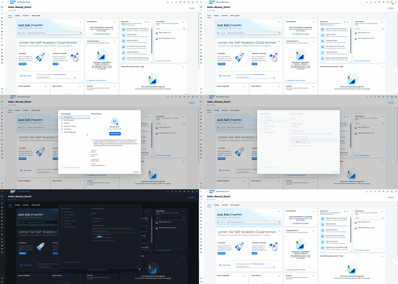
SAP will introduce the new Q4 Horizon Design: a modern, unified user interface (UI) across all SAP products. With the new UI themes (Horizon Morning, Horizon Evening, High Contrast White/Black), the user interface has been completely redesigned.
The main advantages of this innovation:
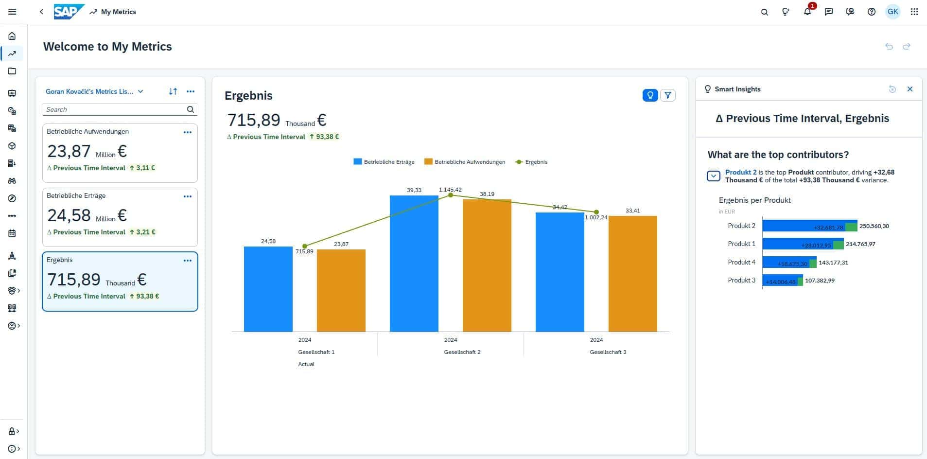
My Metrics replaces the previous Watchlist My Metrics now offers a standalone KPI module where users can consolidate key metrics from various stories and models in one central location. Users can create both private and public KPI lists and receive additional analysis for each metric via dynamically generated insights. New comparison logics (e.g., absolute deviation, percentage deviation, period comparison), configurable visualizations, and the ability to add KPIs directly from a visualization with a right-click make My Metrics a significantly more powerful tool for management reporting and self-service analytics.
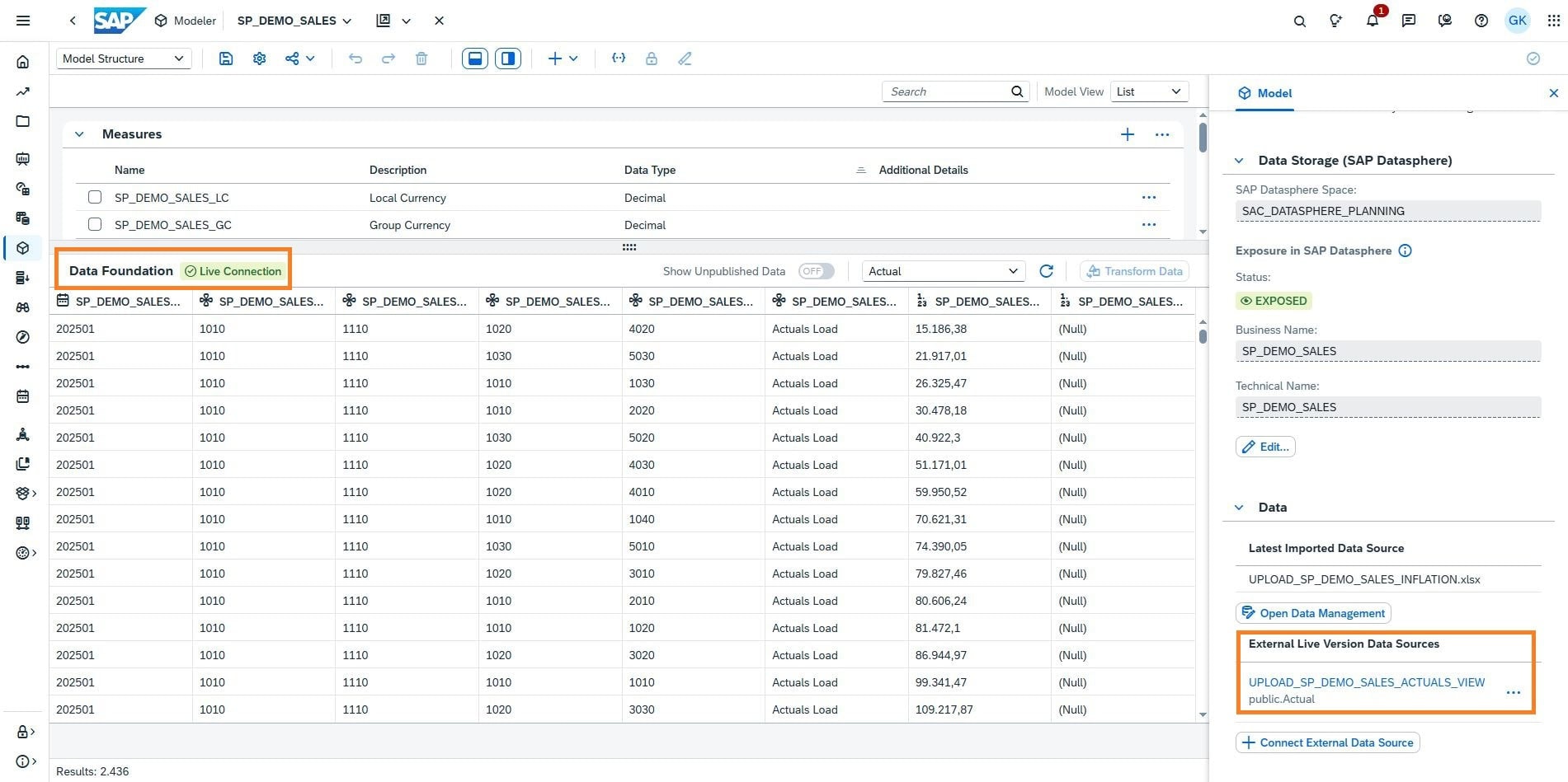
The Q4 release extends Seamless Planning with the ability to integrate actual data live from SAP Datasphere into SAC planning models without replication. Datasphere views are linked to SAC versions via a mapping of dimension and measure structures, so that current factual data appears live in the model. LiveAlthough the data is read-only, it can be used for forecasting, copy logic, or data actions.
The main advantages of this innovation:
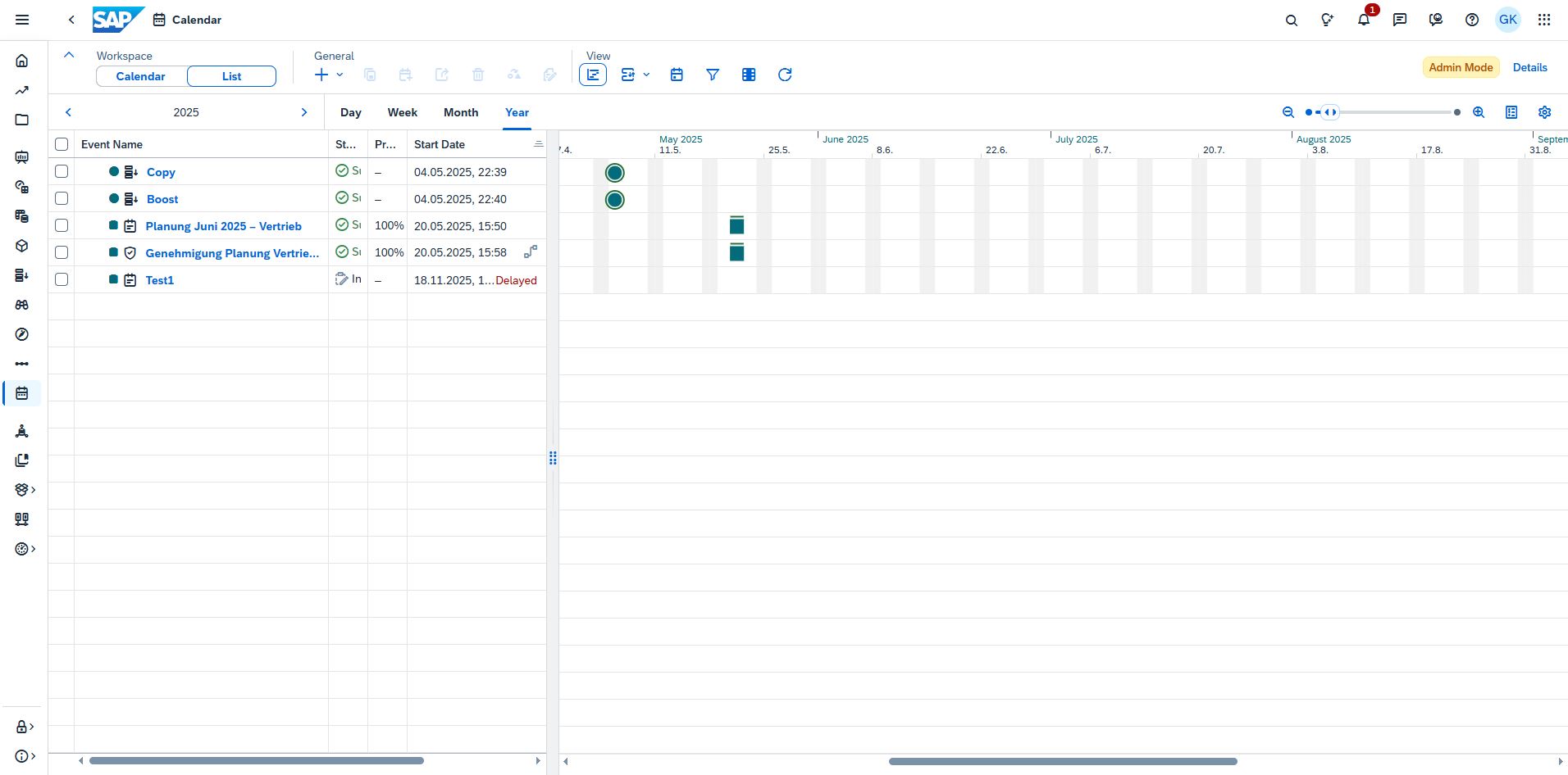
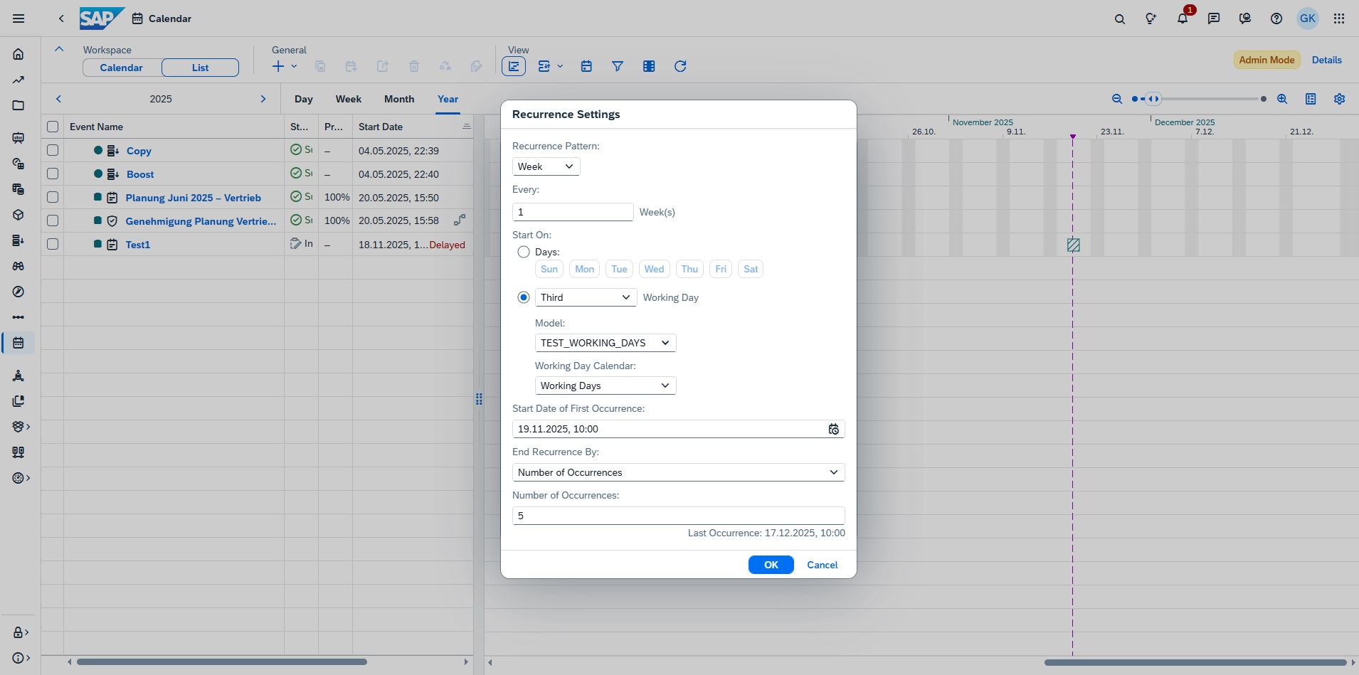
With the Q4 release, planning steps and publication processes can now be fully controlled on a weekday basis for the first time. A custom work calendar model can be created, in which an attribute defines whether a specific day is a workday or a non-workday. This information is visualized directly in the calendar and the Gantt chart, making workdays and non-workdays clearly identifiable. Based on this, recurring tasks and publications can be precisely controlled, for example, "every 3rd workday," "first workday of the month," or "every non-workday before the deadline." This makes planning more robust against holidays and bridge days, generates realistic recurrence cycles, and significantly reduces manual maintenance.
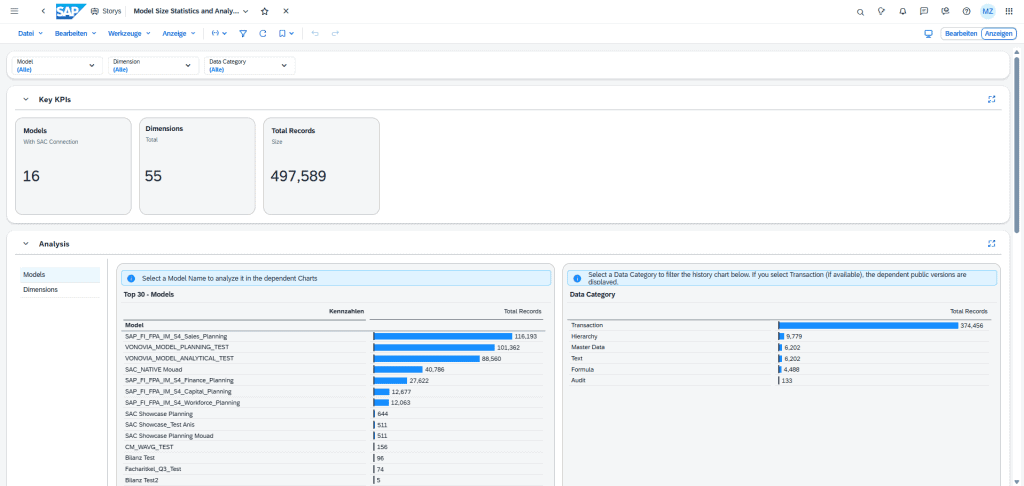
With Q4, administrators receive an enhanced performance content package that provides deep insights into model sizes, audit tables, data categories, and record counts. The new Story Model Size Statistics not only displays the largest models and dimensions but also an overview of the top 30 models by size, as well as record counts for each data category. Additionally, time-based trend analyses are available to evaluate growth, input jobs, or publishing events over time. Drilling down to the model level allows for the precise identification of anomalies, such as sudden load spikes or rapid data growth. This enables system administrators to identify bottlenecks early, optimize models accordingly, and sustainably improve tenant governance.
The Q4 2025 update clearly demonstrates how SAP Analytics Cloud is evolving into an integrated, intuitive, and data-driven platform. The new features (from the modernized user interface and personalized KPI overviews to…) Live-Planning and enhanced governance transparency) empower users and administrators alike.
With these improvements, SAC offers an even more stable foundation for efficient planning, analysis, and reporting processes. Companies gain speed, clear insights, and greater flexibility in their daily work.
INSIRE will gladly support you in using the new opportunities in a targeted manner and optimally integrating SAC into your existing analytics landscape.
They find out here more about the SAP Analytics Cloud.